People don't follow you because you post. They follow you because you're recognizable.
It is easy to pour everything into content and replies and treat the look as decoration. Your colors, your symbols, your recurring themes are doing just as much work. They are the emotional anchors, and until you use them on purpose you won't live rent-free in anyone's head as a brand.
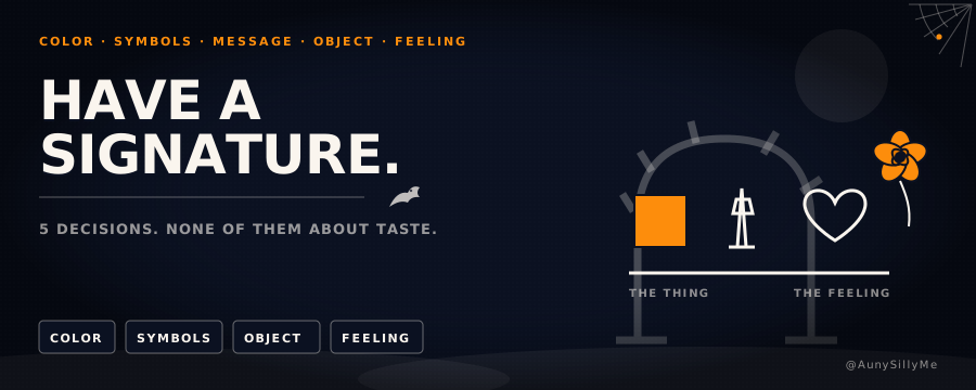
Five decisions make that signature. None of them is about taste.
[Branding doesn't start with aesthetic. It starts with pattern recognition.]
1. pick your anchor color
Choose one color you actually resonate with. Use it everywhere. Keep using it until seeing that color makes someone think of you before they read the name.
Most creators switch colors like they're picking outfits. That resets the pattern every time. Pick one, commit, repeat until the audience is conditioned.
2. choose 2 to 3 signature symbols
Stop sprinkling whatever emoji felt cute that day. Symbols are memory shortcuts, and shortcuts only work if they repeat.
Pick 2 or 3 and use them across everything:
- threads
- newsletters
- carousels
- product pages
- image prompts
They become your stamp. If you want symbols that read as deliberate rather than clutter, coolsymbol.com has the unicode set worth borrowing from.
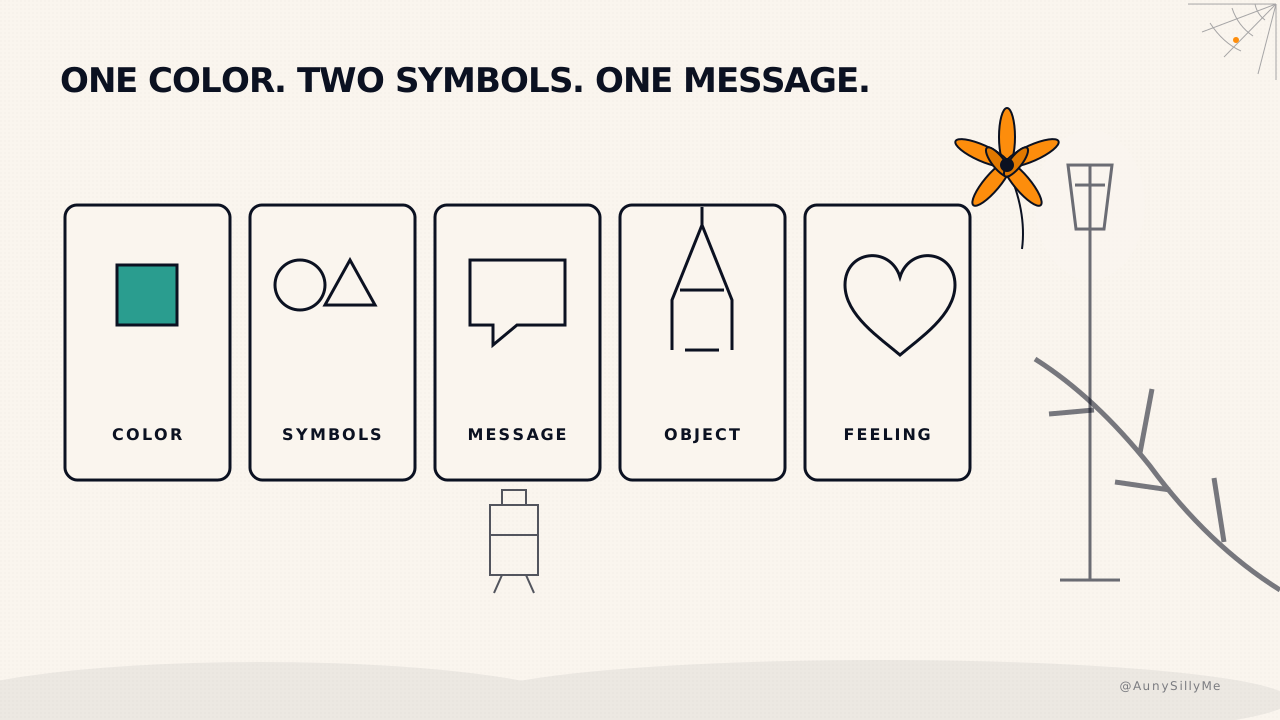
3. define your core message
If your message changes every month, of course the brand feels loose. It should be simple, relatable, repeatable and universal.
Then you repackage it. One-liners, storytelling posts, threads, tutorials, visuals, prompts. Same message, different executions. That repetition is how people start to feel who you are instead of just reading you.
4. pick a recurring object or metaphor
This is the thing that makes the whole brand memorable, and the one most people skip.
- what object or theme feels like you
- what image can carry your personality
- what could become your signature visual world
It ties every separate post back into one story.
5. attach an emotional meaning
Colors alone aren't special. Symbols alone aren't special. Metaphors alone aren't special. The emotion you attach to them is what makes them unforgettable.
- when someone lands on your page, what should they feel
- what part of your personality do you want amplified
- what is the emotional atmosphere of the whole thing
Brands stick when they make people feel something.
a worked example, so it's not theory
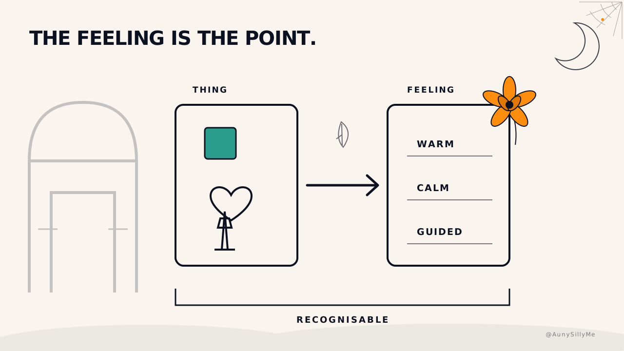
- color: one orange,
#FD8D0C, on the website, the invoices, the product images, the profile. One system since 2026-08-04, the website wins and everything else matches it - symbols: 🧡 and a lighthouse
- metaphor: the lighthouse. Something that reads as calm, and as guiding someone else through the dark
- core message: explained without fluff. Plain words on purpose, receipts over opinions
- feeling: warm, with a spine
The orange heart is there because it reads warm. The lighthouse is there because it is something to feel at peace around, and because being the light that guides someone else is the point of the whole thing. Pick yours for a reason you can say out loud.
Two registers can coexist on one person: a company system and an artist system with its own palette. What can't coexist is 3 palettes on 3 surfaces, so a client sees 3 different companies.
the blueprint
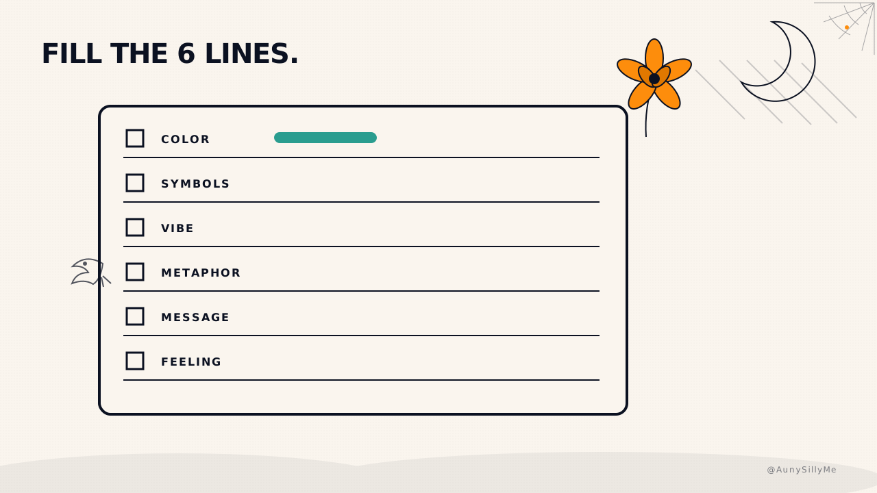
Copy this and fill it out.
☑ color: ______
☑ symbols (2 to 3): ______
☑ vibe (3 words): ______
☑ metaphor / object: ______
☑ core message: ______
☑ what a stranger should feel on your profile: ______
This is the backbone of your identity. The whole brand gets easier once these are locked in, because every new post, image and page finally has something to match against.
where the signature gets applied
The signature is the decision layer. The place it shows up first is your profile, and those 3 surfaces have their own checklists: banner, bio and pinned post, in blog 10. Fill the 6 lines here, then go make those 3 match.
do this tonight
Fill the 6 lines. Then change one thing on your profile to match them. One. Banner color, bio emoji, pinned photo. Screenshot the before and after 🧡
1:1 call · matches this post
Brand Playbook Buildout
want the blueprint built out into a full playbook, colors, fonts, symbols, voice rules and templates, written down so you never re-decide it? That's the Brand Playbook Buildout.