People don't follow you because you post. They follow you because you're recognizable.
You're hyper-focused on content and replies. Your colors, your symbols, your recurring themes are just as important. They're the emotional anchors, and until you use them on purpose you won't live rent-free in anyone's head as a brand.
This is the kit: what your profile is actually made of. The decisions underneath it, your color, symbols, message, metaphor and the feeling you attach to them, are the signature, and they have their own post in blog 24.
the kit is one funnel, not 3 decorations
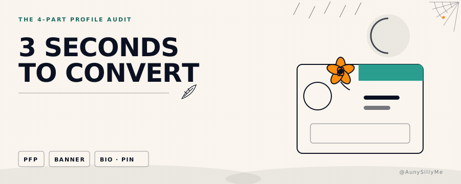
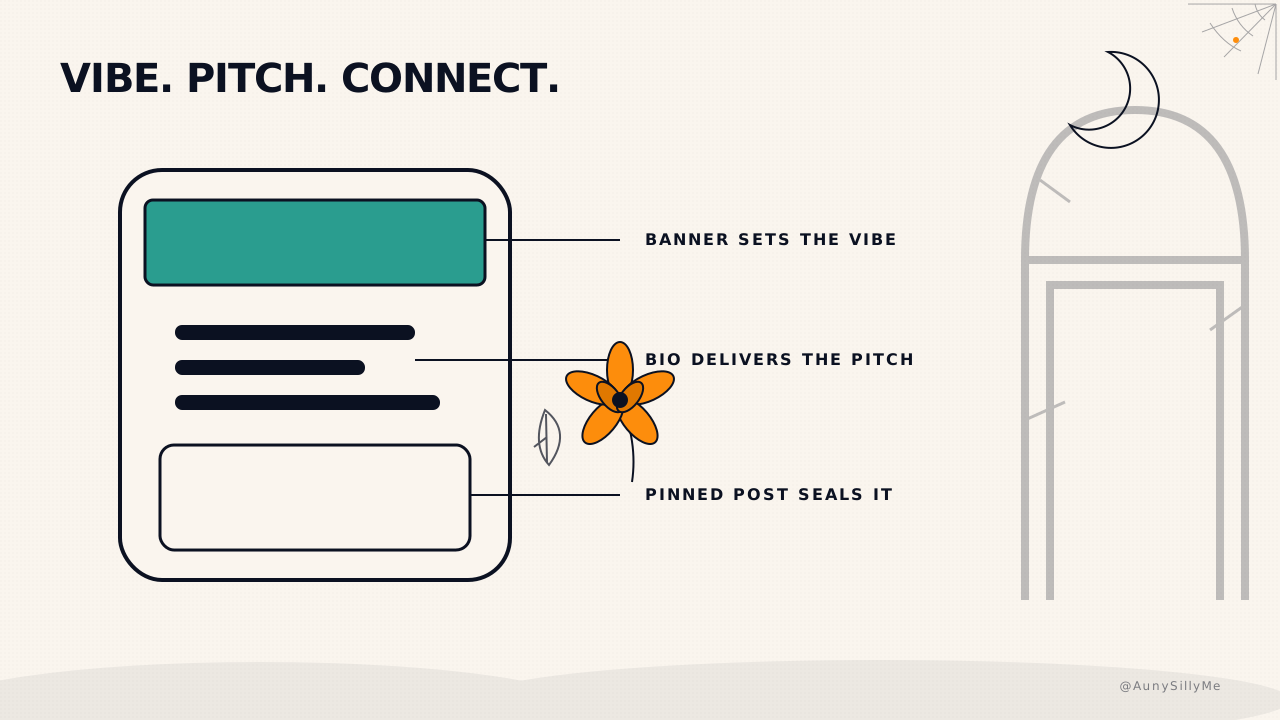
Somebody reads a reply of yours, likes it, and taps your name. What happens in the next 4 seconds decides everything, and it happens in a fixed order:
- your banner sets the vibe, before a single word is read
- your bio delivers the pitch, in the two lines they will actually read
- your pinned post makes them feel something and seals the follow
Each one hands off to the next. A banner that impresses and a bio that confuses stops the chain just as dead as no banner at all. Treat them as 3 steps of one funnel, not 3 slots to fill.
what each one is for
the banner: one purpose, not four. Pick a single job for it, a quote, a CTA, an offer, or pure vibe, and cut everything that serves a different one. 1500x500, 2 to 3 colors, and a symbol that is yours rather than a stock flourish. The most common mistake is cramming all four jobs in and landing none of them.
the bio: hook, proof, CTA, in that order. Under 160 characters, so every word is paying rent. Separators rather than sentences, because nobody reads a paragraph on a profile. Zero hashtags. The hook says who it is for, the proof says why you, the CTA says what to do next.
the pinned post: who, what, why, vibe, and a face. This is the only one of the 3 that can make somebody feel connected to a person rather than a page, which is why a photo belongs in it. Refresh it every 1 to 2 months. A pinned post from last spring tells a visitor you are not really here.
The full audit for each, with the checklists and a pinned-post template you can copy, is blog 6.
how to tell if they are aligned
Open your own profile in a private window, the way a stranger sees it, and read the 3 in order. Then answer:
- do the banner and the pinned post use the same colors
- does the bio promise the thing the pinned post delivers
- could a stranger say what you do, out loud, after 4 seconds
- does the same symbol appear in at least 2 of the 3
Any no is the thing to fix first. It outranks posting more, because everything you post sends people back to this page.
If the 3 aren't aligned, the profile is not converting, no matter how good the posts are.
do this tonight
Pick one thing the 3 surfaces should share, then change one of them to match it. One. The banner color, the bio's first 5 words, the pinned photo.
If you have not decided what they should share yet, decide that first. It is 5 questions about your color, symbols, message, metaphor and the feeling you want someone to leave with, and it is blog 24. Answer those, then come back and make the banner, the bio and the pinned post agree 🧡
1:1 call · matches this post
Content & Branding Strategy
want the blueprint built out into a full playbook, colors, fonts, symbols, voice rules and templates, written down so you never re-decide it? That's the Content & Branding Strategy call.